Examining the Output
Step 2 Custom Graphs and Tables |
|
Vensim PLE's real output capabilities are utilized through custom graphs and tables. There are many more possibilities than can be addressed here, but this guide will walk through simultaneously looking at the number of susceptible and infected people over time in both graph and table forms. Consult the figures below for reference while working through this procedure. Procedure:
 First, click on the Control Panel button to bring up the Control Panel window (shown below). First, click on the Control Panel button to bring up the Control Panel window (shown below).- Click on the Graphs tab and then click the New button for a new graph.
- Name and tittle the graph something like "Population Status" and "Susceptible and Infected People over Time" respectively.
- Click on the box labeled Sel to the right of X-Axis and choose Time from the pop-up window.
- The rows near the bottom are for adding variables to the y-Axis. Click on the first and second Sel buttons and choose Susceptible People and Infected People respectively.
- Click OK and the graph will appear in the Control Panel window (under the Graphs tab) with the name that you gave it.
- To view your graph at any time, open the Control Panel and double click on the graph name or select the name and click Display.
- To create a table, repeat the process above but stop short of clicking OK. Instead, select As Table...
- The window will change, offering new options for formatting a table, but you can access the data by simply clicking OK.
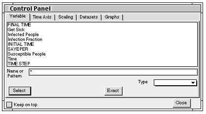
Control Panel Window
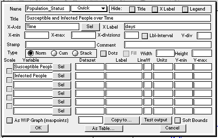
Custom Graph Design Window
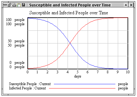
Custom Graph of Population Status over Time |
 
|