JavaScript Model Story
This model has a world with cars represented by black circles and buttons which allow the user to see the projected air quality level (using color indicators which correspond with the Air Quality Index) based on different conditions (Los Angeles County once it reopens, if it stays in lockdown, and what a "normal" year's air quality is like). Each circle represents 800,000 cars. Therefore, during 2017 and 2020 Reopened, there are 8 million cars in the model, and during lockdown there are only 3 million cars. The canvas color changes according to the average monthly air quality. The three buttons allow the user to see the average monthly air qualities in Los Angeles County in 2017 and the projected air quality of 2020 if it reopens or if it stays in lockdown. Once one of the buttons is pressed, the model starts displaying color in 3 seconds, and once it is done playing, the counter will display in the console.
System Model Story
Using the trends that I discovered by using the EPA’s data and an Excel function, I created a VensimPLE model to show the trends of the air quality in LA County. I made a graph showing the differences in the trends between 2017 and 2020 AQI values. I have a level block to represent the air quality and the model uses variables like the usage of vehicles and planes to see how that affects the trends.
Trend for 2020: y = 52.01861 * 1.002692^x
Trend for 2017: y = 68.34525 * 1.001093^x
Model Question
If LA County is in lockdown, how will the AQI values for the year compare to 2017?
Hypothesis
The AQI values if Los Angeles County is in lockdown will be significantly less than those in 2017.
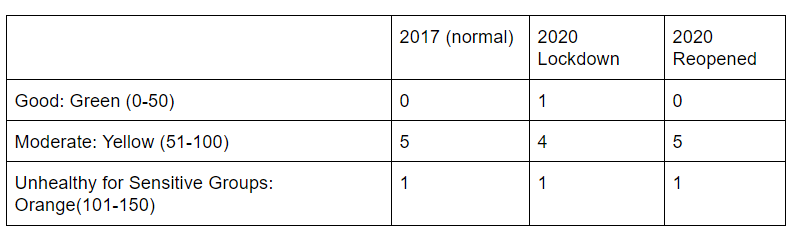
Results
Results vs Expectations
Based on the results of my Agent Model, my original hypothesis was incorrect. I thought that the decrease in cars would drastically impact the Air Quality values per month, however, the decrease in car usage only contributed to a decrease in NO2 values which was not enough to lower the Air Quality values. Since the Air Quality Index factors in pollutants like carbon monoxide, lead, nitrogen oxides, ozone, particulate matter, and sulfur, the decrease in NO2 was not enough to significantly lower these values.
Based on the results of my System Model, it was apparent that the number of planes flown didn't have a large impact on the overall air quality. It is also apparent that the estimated values (from the System Model) didn't correlate with the actual data collected from the EPA.
Changes
In order to make this model more user-friendly, I modified the Air Quality Index colors slightly to make it easier to understand. As the values increase, the colors become more intense. For example, values between 51 and 75 display a pale yellow while values between 76 and 100 display a brighter yellow.
What I Learned
I learned a lot about air quality as well as the pollutants that can affect it. In addition, I learned more about the application of switch functions, the setInterval method as well as animations.