Full Model
The full model can be found by CLICKING HERE. VensimPLE is required to run this model. To download Vensim, CLICK HERE.
The Model
Graphing the Model
Description
Model's Story
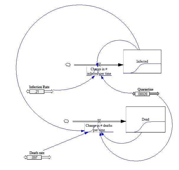
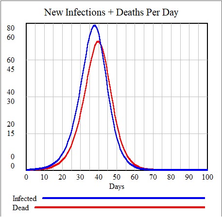
This is a system model with two diagrams and a rate going towards a level in each one. One diagram has the level “Infected” while the second has the level “Dead.” The initial value of both levels is 1. The equation for both the levels is equal to its corresponding rate to show how the change in infections/deaths affects the total people who got infected or died. The rate pointing to the Infected level is called “change in # infected per time” while the rate pointing to the Dead level is called “change in # deaths per time.” The first diagram is affected by the variables, “Infection rate” and “Quarantine” while the second diagram is affected by the variables “Death rate” and “Quarantine.” Arrows point from Infection rate and Quarantine to Change in # infected per time. Also, arrows point from Death rate and Quarantine to Change in # deaths per time. The variable “Infection rate” has the equation 0.21 to model the actual 21% infection rate in New York City. The variable “Death rate” is given the equation 0.097 to model the 9.7% death rate in NYC. The variable “Quarantine” is given the value 0, with a max of 0.002 to show the difference in cases when quarantine restrictions are put into place. These numbers are variable once the model is simulated, and you can change the variable values for different outcomes in the graph. An arrow points from the Infected level to the rate “Change in # infected per time,” and the rate has an equation to model the exponential growth rate of cases. An arrow points from the Infected arrow to the Change in # deaths per time rate as well and the rate for deaths has an equation to show how the infected people from the previous diagram go through the chance of dying. The Dead level has an arrow pointing to Change in # deaths per time to show how quarantine can lessen the number of deaths from the virus, which has been integrated to the rate. There is an interactive graph that changes as each of the variables are changed in the model, with lines for Infected and Dead.
Notes
- The rates and much of the statistics were as of June 15th, 2020, and are subject to change.
- All of the numbers are scaled down by 100, in order to fit the restrictions of the graph.
- The first case starts on DAY 1.
- The graph only graphs the NEW INFECTION AND DEATHS RECORDED PER DAY, not the total. For the total, click on the Vensim file for the model, and look at the total graph shown on the Infected Level (box) or the Dead level.
Version Control
The full version control of each and every version of the model can be found by CLICKING HERE. Once again, VensimPLE is required to run the model. To download Vensim, CLICK HERE.