|
|
Temperatures
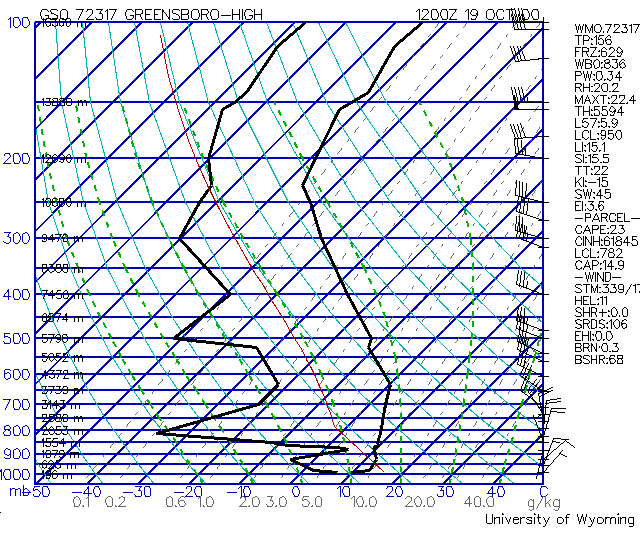
Several temperature values are plotted on a chart, such as the temperature of the atmosphere (ambient temperature), the temperature of a parcel of air rising dry adiabatically, and the dewpoint temperature. The ambient temperature is always plotted on the right. On some web pages versions, such as NOAA's GOES soundings chart, colors are used to help identify the temperature of the environment, the dewpoint temperature, and the temperature of the parcel of air. In essence, different thermodynamic products from different institutions look different. Stated another way, the same sounding data plotted on two different thermodynamic diagrams look different! Let's do a side-by-side comparison with two diagrams for Pittsburgh, Pennsylvania, both taken on December 4 2000 at 1200 GMT. We'll return to this comparison later, but for now we'll only look at temperature values. On the NOAA Skew-T plot, you will see a number of lines. The red lines represent the temperature of the atmosphere (ambient temperature), while the black line represents the dewpoint temperature. Using the temperature grid, we determine that the 500mb ambient temperature is about -25C, and the dewpoint at that pressure is about -33C.On the Wyoming Skew-T plot, you will see two dark solid lines. The line on the right represents the temperature of the environment. You should be able to determine from this plot that the value at a pressure of 500mb is -25 C. You will have to interpolate the 25 degrees since the black temperature plot hits the blue 500mb isobar between -20 and -30. Temperature isotherms for the Wyoming are plotted along the bottom of the graph in dark blue. The line on the left represents the dewpoint temperature. At 500mb, the dewpoint temperature is roughly -38 C. If you have closed the two diagrams for Pittsburgh, you should re-open them at this time. In a "normal" atmosphere, the temperature should decrease with altitude. In both Pittsburgh charts, we notice that the temperature rises until around 900mb, becomes isothermal (non-changing temperature) roughly through 500mb, then decreases for a period of time. We can use the location where the temperature changes from decreasing or increasing to measure the location of the tropopause. If you recall from a previous reading, we can also determine the LCL (lifting condensation level), using the LCL calculator.Inversions
Confused? Have a question? If so, check out the Frequently Asked Questions (FAQ) page or send mail to the OS411 tutor (os411tutor@shodor.org) with your question! Report technical/content problems here |
|
|