| |
|
Upper Air Maps and Data
Upper air charts show, as the name suggests, a variety of conditions in the upper part of the atmosphere. Data for these charts come from twice-daily radiosonde soundings. The key advantage of upper air charts is that they help meteorologists to get a feel for the "multi-dimensionality" of the atmosphere. For example, a 500-mb map shows the structure of the atmosphere at a pressure level of 500 millibars, about half the pressure at sea level. What is shown on these charts are the elevation of the surface at these levels. For example, a contour that is labeled "5400" says that the pressure at 5,400 meters above the ground is 500 millibars. Areas that have the same elevation are connected together with lines to form contours.
The discussion found in this reading is a very broad overview of upper air maps. The interested reader should consider the excellent descriptions found on the Unisys weather pages.
| Mandatory level plots:
These are composite plots that show height contours at various pressures:
- 500 mb
- 700 mb
- 850 mb
They also contain a temperature analysis with isotherms (in yellow) drawn at levels of every five degrees Celsius, as well as the "standard" station info: temperature, dewpoint, and wind speed/direction. |

|
| Constant height plots:
Constant height plots are primarily aviation tools, with temperatures shown in yellow and wind speeds in blue (increasing in "blueness" with increasing speed). There are eight different types of plots, beginning at 3,000 feet, up to 36,000 feet in increments of three thousand and six thousand feet. You might also see some blue shading on these charts. This shading indicates wind speeds at or above 30 knots, with different intensities of shading for 20-knot intervals. |

|
| Hemispheric plots:
As this name suggests, these plots show the entire northern and southern hemispheres, showing either 500-mb or 850-mb height fields or 850-mb heights and temperatures. The graphic at right shows the 850-mb height and temperature plot. Notice the United States located at the bottom of the graphic. In this particular chart, the colors represent temperatures in increments of 2 degrees Celsius at the 5,000 ft level. |

|
Contour plots:
There are a wide variety of contour plots, such as:
- 500-mb heights
- 850-mb temperatures
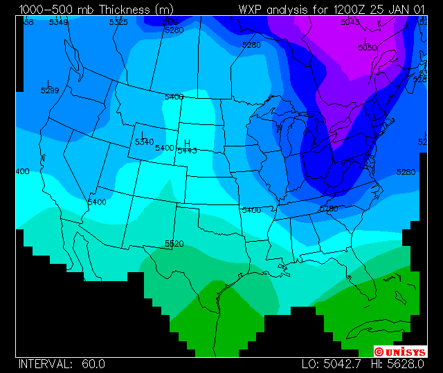
- 1000-500-mb thickness (this is the graphic shown at right)
- 300-mb wind speeds
- precipitable water
- lifted index (LI) stabilities (discussed in more detail in later readings)
- total totals (TT) index stabilities (discussed in more detail in later readings)
- K-index stabilities (discussed in more detail in later readings)
- CAPE contours (discussed in more detail in later readings)
- Helicity contours
Most meteorologists look to the 500-mb chart as the "driving force" of the upper atmosphere, since the majority of the weather system (including precipitation patterns) follow (are steered by) wind flow at this level. Charts such as the 1000-500 mb contour plot show the thickness of the troposphere (in meters). The usefulness of this is that thicknesses below 5400 meters tend to indicate areas where, if there is to be any precipitation, it will be in the form of snow. Snow lines might also appear on 85 kPa isotherm contour plots: looking at the -5 degree C isotherm, locations on the cold side of that line are good candidates for snow.
|
|
Confused? Have a question? If so, check out the Frequently Asked Questions (FAQ) page or send mail to the OS411 tutor (os411tutor@shodor.org) with your question!
Report technical/content problems here
|
|