Histograms vs. Bar Graphs
|
Student: Histograms and bar graphs look very similar. What's different about them?
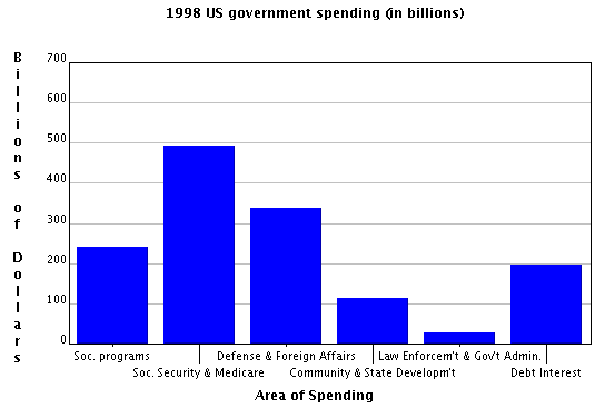
Mentor: Let's take a look at an example of each. Here's a bar graph. What do you notice about it?
Student: Well, the bars represent different categories. Mentor: Exactly! Could we rearrange the bars if we wanted? For example, could we move "Debt Interest" to go after "Social Programs" but before "Social Security & Medicare"? Student: I think so. It doesn't look like the order matters at all as long as the billions of dollars still matches every category.
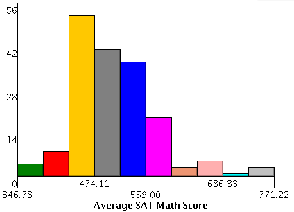
Mentor: That's right! Let's take a look at a histogram now and tell me what you notice.
Student: The bars don't really represent different categories anymore. Or if they do, they're not as clearly labeled. Mentor: You're right! They don't represent different categories. Can you tell what they do represent? Student: It says "average SAT math score". I would think that the height of the bars represents the number of people who got that score. So then the different bars show how many students got each score, right? Mentor: Is that what the histogram says? Every student who gets a 500 is put into one bar, and every student who gets a 510 is put in another bar? Student: No, there aren't enough bars for that. Mentor: Then how do they decide which scores go into which bars? Student: It looks like they use ranges, but I'm not sure how they know what range to use. Mentor: That's exactly right! Histograms use continuous data where the bins represent ranges of data rather than categories. Can you rearrange the bars in a histogram like you could in a bar graph? Student: No, that would be too confusing. Mentor: Exactly! Now let's think about different sets of data and which would be better a histogram or a bar graph. For instance, let's suppose we want to compare total revenues of five different companies. Would you use a histogram or a bar graph? Student: I would think you'd use a bar graph where each company is a different category and gets its own bar to show total revenue. Mentor: That's right! What about another example: We have measured revenues of several companies. We want to compare numbers of companies that make from 0 to 10,000; from 10,000 to 20,000; from 20,000 to 30,000 and so on. Student: Those are ranges of data so that sounds like a histogram. Mentor: Exactly! Now what if we were looking at answers from a test question where students had four choices: 4, 5, 6, and 7. We want to compare how many students chose each answer. Histogram or bar graph? Student: Well, they're a series of numbers just like the SAT scores so I would choose a histogram. Mentor: Suppose that the answers to a test question were the following: rabbit, horse, dog, elephant. Which would you choose then? Student: Bar graph because they're different categories. Mentor: That's right. In the case of the answers 4, 5, 6, and 7, you would do the same thing. These are categories, even if the category labels are also numbers. They're not ranges like you need for a histogram. Student: I think I get it now. Even if there are numbers, you have to ask whether or not they're ranges or categories. Mentor: Exactly! I think you're ready to start working with histograms and bar graphs now! |