"The Bell Curve" Revisited
|
Student: But how can we prove the book wrong? Mentor: Remember, we're not proving the book wrong, we're proving the conclusions people drew from it wrong. The book is too complicated for me to explain quickly what scientists found was wrong with it. That's why it took so long for the other evidence to surface. Student: But how can I? Mentor: You're persistent. Well, I can show you. The book claimed that each group of people had a normal curve of their own -- that some of them were very low and some were very high and many were in the middle. Then it went on to say that the middles were different. Student: So there will always be a few people out in the tails that will be different? Mentor: More than that, but that is the right idea. Let's make two transparencies of the normal distribution, one purple and one green. Now let's say that Purples are smarter than Greens. Student: I don't know anybody who is purple, or green, so I suppose they could be. Mentor: The big difference the book mentioned was about fifteen points on an IQ test score, one standard deviation. So let's put the mean of the purple distribution on the right, one-standard-deviation line of the green distribution, like this.
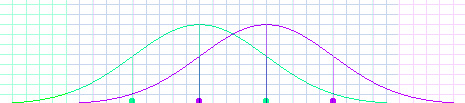
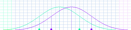
Student: They overlap a lot. Everywhere the grid is blue, they overlap. Mentor: Actually, they overlap all the way out. But the probability of a green being out in the purple section, or a purple in the green section, is one in a thousand. Student: That is a very small probability. Mentor: Of course, the probability of a purple in the purple section, or a green in the green section, is less than two in a hundred. That's bigger, but it's still small when you think about how randomly assorted people are. Remember when you made a histogram fit under each curve? It didn't fit very exactly. Student: So there could be several people in that section, or there could be none. Mentor: But what's more important is that there is a big overlap section in the middle. That means it is very common for both Purples and Greens to be in that whole area. Now, imagine making a histogram for each graph, only with one trial. Do you think it's worth assuming that the purple trial would be higher than the green? Student: It depends on what the outcomes are. If I were playing a dice game with my friends, I would like those odds. Mentor: But if you were betting a job, or a friendship, or the future of your new business... Student: Then it would not be very good odds. Mentor: I would like to be much more certain before I judged a person. That's why I said I couldn't say anything about you or me based on what the book said, even if I decided I thought the book was right. Student: I would not like to judge one person either. But there is still a big difference between the Purples and the Greens as groups. Mentor: That bothered many people. But then some of the scientists said the difference between the means was too big, and started talking about a difference of eight or nine points -- about 3/5 of a standard deviation. That looks like this.
Student: That has a much bigger overlap. Mentor: Then finally some of them said that the difference was only three points, about 1/5 of a standard deviation. Now even if that were true, what can you say about this graph?
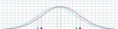
Student: That's hardly any different at all! It doesn't matter. Mentor: It doesn't seem like it's worth starting a controversy over now, does it? |
