Line of Best Fit
|
Student: Why does the line of best fit not always touch as many points as possible on a scatter plot? Mentor: A line of best fit is often useful to attempt to represent data with the equation of a straight line in order to predict values that may not be displayed on the plot. The line of best fit is determined by the correlation between the two variables on a scatter plot. In the case that there are a few outliers (data points that are located far away from the rest of the data) the line will adjust so that it represents those points as well. Student: But why does it need to include outliers if most of the data is in one area of the scatter plot? Mentor: A line of best fit represents ALL of the data in a scatter plot so it must include the outliers in order to be an accurate representation. Student: Well, how do I know where to draw the line of best fit when the data includes outliers? Mentor: It is not too hard to make a close guess if you take some time to look at the data. We can try doing that with a problem right now. We can use the activity Regression to help visualize it. First, plot (1,2) (2,3) and (3,4). How do you think the line of best fit for this data will look? Student: The line of best fit will touch all of those points because those points make a straight line. The line will go upwards and it will be pretty steep. Mentor: That is right. We can take a look at the line by selecting the button Display line of best fit . The line of best fit crosses through all of the data points just like you said. However, if you add the point (9,3) what do you think will happen? Student: I think that the line will adjust so that it will be less steep. It will not touch all of the data points. Mentor: Well, you can deselect Display line of best fit , plot the outlier, and then select Fit your own line so you can show me what you are thinking. Student: I think it would look something like this:
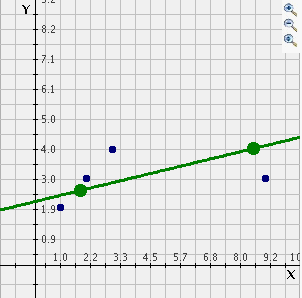
Mentor: Now you can check how close your guess is by selecting Display line of best fit . That is very close! You can compare the equations to see how close you were as well. The equation for your estimated line of best fit is in green and the equation for the true line of best fit is in red. This program could be fun to use to experiment with what could happen with outliers in different places on the scatter plot or by plotting more dots in one area. Student: Cool! Now I understand how to draw lines of best fit more accurately and I know what to keep in mind when there is an outlier. |
