Vertical Scale: Increase or Decrease?
|
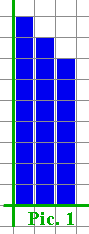
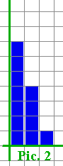
Student 1: The vertical scale can really change the appearance of a histogram or bar graph! Student 2: Oh yeah. These two pictures represent the same data set:
Mentor: Are they histograms or bar graphs ? Student 2: They are bar graphs. I had measurements of unemployment rates in mind. The first one shows that unemployment stayed almost the same over the three years pictured, and the second one shows that it was declining rapidly. I would use the second one if I were a mayor of the town we are talking about running for the second term. Student 1: And I would use the first one if I were a competing candidate. Can you please tell us the scales? Student 2: In both Picture 1 and Picture 2, each bar represents one year. Student 1: Oh, you did say they talk about a three year period. What about the vertical scales? Student 2: In Picture 1, the vertical scale is 30 (unemployed) per unit length. In Picture 2, the vertical scale is 10 per unit. They also start from different values. For the first one, the vertical count starts from zero. Student 1: I can figure out when the second one starts! Picture 1 shows 270 unemployed for the first year (9 units, 30 unemployed per unit, starting from 0). Picture 2 has to show the same number. There are 7 units for the first year in Picture 2. With 10 per unit, it makes 70 unemployed. So the count along the vertical axis of Picture 2 has to start from 200, with 10 (unemployed) per unit length. Mentor: Let us summarize. If the vertical scale of a graph has less values per unit length, what does it do for people's impression of the graph? Student 1: It "stretches" the graph. Student 2: It makes the graph look more jumpy. Mentor: Or more dramatic. It exaggerates any differences, as we saw in Picture 2. Student 1: But if we make the vertical scale to have more values per unit length, as in Picture 1, the graph will look smoothed out. Student 2: The differences are less visible this way. Also, if you cut off the lower part of the graph, as in Picture 2, the graph looks jumpier. Student 1: Now we are ready to work as public relations persons! Mentor: Oh, maybe there is a thing or two about data presentation and mis-presentation that you may want to learn before applying for the job... |